Air Quality and U.F.O Sightings Dashboard
This dashboard is a project I worked on for Information Visualization, a course I took during my undergraduate degree. We talked about different ways of representing large amounts of data for easy readability. The final project for the course was to select a public dataset and design a dashboard for visualizing it.
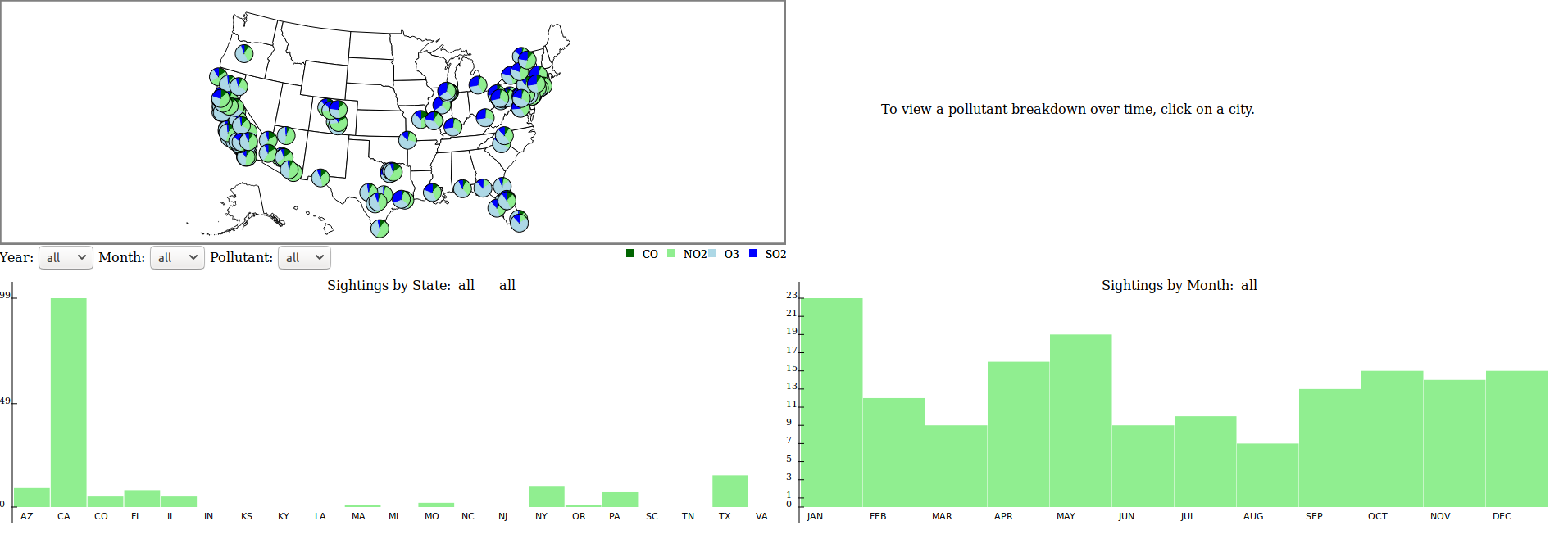
My group partner and I chose to work on a dataset containing Air Quality readings along with U.F.O sighting information tagged by location in the United States. It presented an interesting opportunity to represent complex data fields with relation to a geographic location, and was also fun to work with. The dashboard is built using Java Script and d3.js. Unfortunately, the dataset itself is unfinished, which causes some problems with the interactive plots for certain location selections, but the concept of the dashboard should work if the dataset were to be updated.
Check out the official project site: Air Quality and U.F.O Sightings Dashboard