A Study on UI Interactions In Virtual Reality
For the course CMPT 481: Human Computer Interaction we were required to complete a group project related to interface design. Myself and three others decided to do a research study on the affects of different button attributes in a Virtual Reality setting.
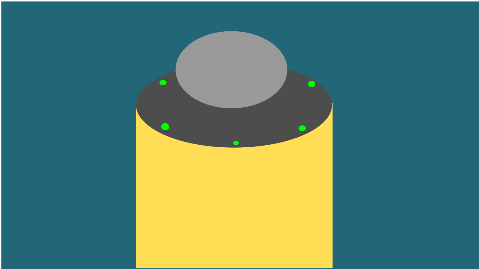
The first milestone for this project was to create a low-fidelity prototype of our system. For this we first created sketches of different buttons that we wanted to test. We decided to split button attributes into three categories: Design (The shape of the button), Texture, and Feedback Type. Each member of the group did Ten Plus Ten Sketching to generate different ideas for each category. We ended up with 100 total button idea sketches which we narrowed down to nine. We tested three designs, three textures, and three feedback types. For the designs we chose a hexagon shaped button, a circle shaped button, and a tube shaped button. The textures we chose were metal, rock, and transparent. Finally, the feedback types we chose to test were no feedback, light feedback, and audio feedback. Once we had decided on our buttons, we created a storyboard of our test.
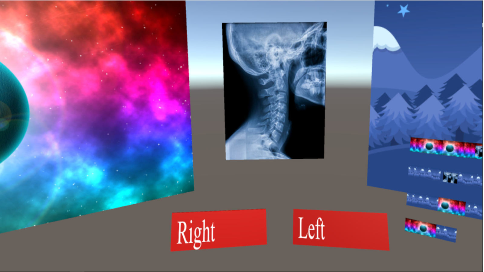
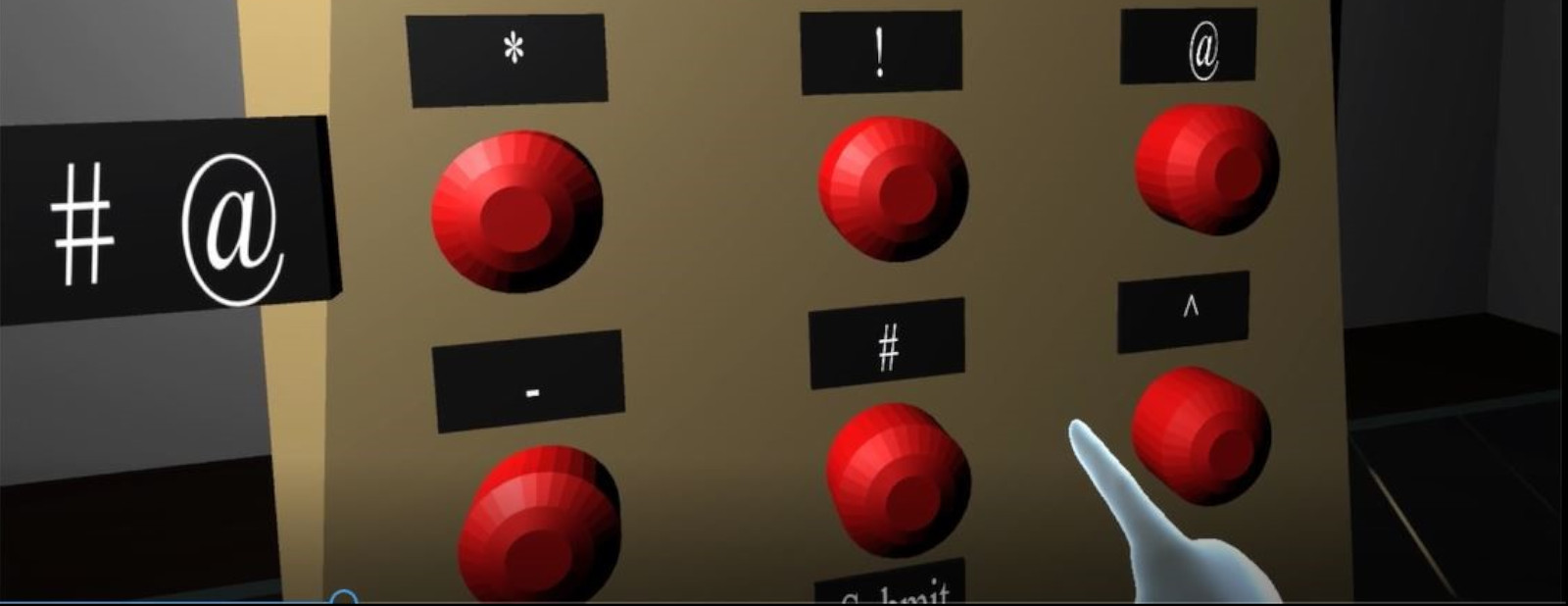
The next milestone was to create a medium-fidelity prototype of our system and evaluate it with users. We implemented our nine buttons in VR using Unity 3D. For each button test, we presented the user with a sequence of characters to enter on a number pad made up of nine buttons of the type of button being tested. The user would enter the sequence as best as they could, with no indication of whether they had entered the sequence correctly or not. During each test we measured the time the user took to enter the sequence and their accuracy. The accuracy in this case was defined as the number of correct button entries over the number of total button entries. Once the user had completed each of the nine button tests, they completed a short survey about what they thought about the buttons.
We tested with twenty five users. For the set of design tests we determined that the circular button was the most efficient and user friendly. The hexagon button had a slow time, but it is important to note that it was the first test for each user and thus may have been biased by the fact that users may not have fully understood the test. Many users commented that the tube button was confusing. The textures we chose had no affect on the efficiency of the buttons. Finally, it was no surprise that the buttons with no feedback had the worst efficiency as users had absolutely no indication that the button had been pressed. The light and audio buttons had the best efficiency. Box plots of the results can be seen below.